Pokemon TCG Dashboard
Motivation
The Pokemon Trading Card Game (PTCG) is a turn-based card game based on the ever popular game franchise. Each player builds a 60 card deck, and the objective of the game is to take all your prize cards by knocking out your opponent’s Pokemon. Players may choose to include any cards in the legal card pool in their deck. There are different decks or archetypes that focus on different Pokemon, and thus, different strategies for victory.
Each year, players compete in official events for prize money and aim to accumulate Championship Points which are required to receive an invite to play in the World Championships at the end of the year. The prize pool has increased for the 2024 season, and there is almost $5 million dollars up for grabs. The motivation for this project was to build a dashboard that tracks the performance of different decks over time to help players better understand different matchups so that they can select a deck that maximizes their chances of winning games at official events.
About the Data
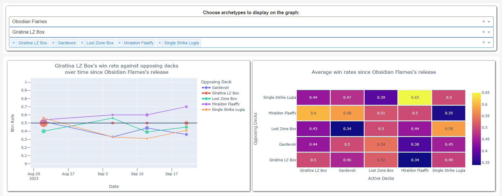
The dashboard currently displays two graphs - a line graph showing win rates over time, and a match-up heatmap displaying overall win-rates between different decks. The data used to calculate these values are from online tournament results. Limitless TCG is a website that provides a platform for tournament organizers to host online tournaments with games being played on the official digital version of the card game, Pokemon Trading Card Game Live (PTCGL). The data for the dashboard was scraped from Limitless TCG. I specifically looked at the Late Night series of tournaments. This organizer regularly hosts tournaments that routinely draws in 100+ players per tournament. By looking at data from the largest tournaments, we get a larger sample size of matchups which should give a better indication of the performance of each archetype.
Scraping Process
The data that was scraped for each tournament included the Standings and the Pairings. The Standings data contained the name, ID, selected deck archetype, and record for each tournament participant. The Pairings data consisted of 15 tables, one for each round of the tournament. In each round, competitors are paired against one other player, and play a best-of-3 match to decide the winner. Each record in the Pairings data represents a tournament pairing, and has details such as the name of the two competitors, and the game score for each competitor, where the game score is the number of games won by that player in the best-of-3. The final result of scraping resulted in 16 tables of raw data that required further processing to obtain the win rates of each archetype.
Data Processing
To calculate win rate, I would need to know which archetype won and which archetype lost in each of the pairings. To figure out which archetype was played by each player in a pairing, the Pairings table was joined with the Standings table on Player IDs. Then, by comparing the game scores, I could determine a winning and losing archetype. By iterating through each record in the Pairings tables, I could assign a win, loss or tie for each matchup and calculate win rates.
Plotting and Using the Dashboard
The graphs and dashboard were created in Python using the Plotly and Dash libraries, which was deployed as an interactive web app on Heroku.
To use the dashboard, there are 3 dropdowns that users can select from that change the data displayed on the graphs. The first dropdown represents the name of the Pokemon Trading Card Game Expansion. Every 2-3 months, a new Expansion is released adding new cards to the existing card pool. Because of this, each Expansion defines a new 'metagame', a term used to describe different approaches to playing a game. When new cards are added to the card pool, new archetypes emerge, and existing archetypes can become stronger or weaker. Therefore, the win rates are grouped by Expansion - by selecting an Expansion, you will only be able to select and see data for archetypes that were played since the Expansion’s release date.
The second and third dropdowns represent the 'Active Deck' or the deck of interest, and the 'Opposing Deck' respectively. The line graph will show the Active Deck’s win rates over time against the decks selected in the Opposing Deck dropdown. The Opposing Deck dropdown also affects the heatmap, which shows the overall win rate between different decks since the selected Expansion’s release date. By default, the top 5 decks by games played are pre-selected in the Opposing Deck dropdown.
As time goes by, players adjust their strategies to the new metagame. Archetypes that were dominant early in the Expansion’s release may see a drop in win rate as players make adjustments to their play and deck building choices to deal with the problematic archetype. This dashboard helps visualize these trends over time and players can use this data to guide their decisions with selecting an archetype or with deck building to maximize their chances of winning games at official events.


